
SHCP Haven Ave. Project
BK Art Deco Proposal 1
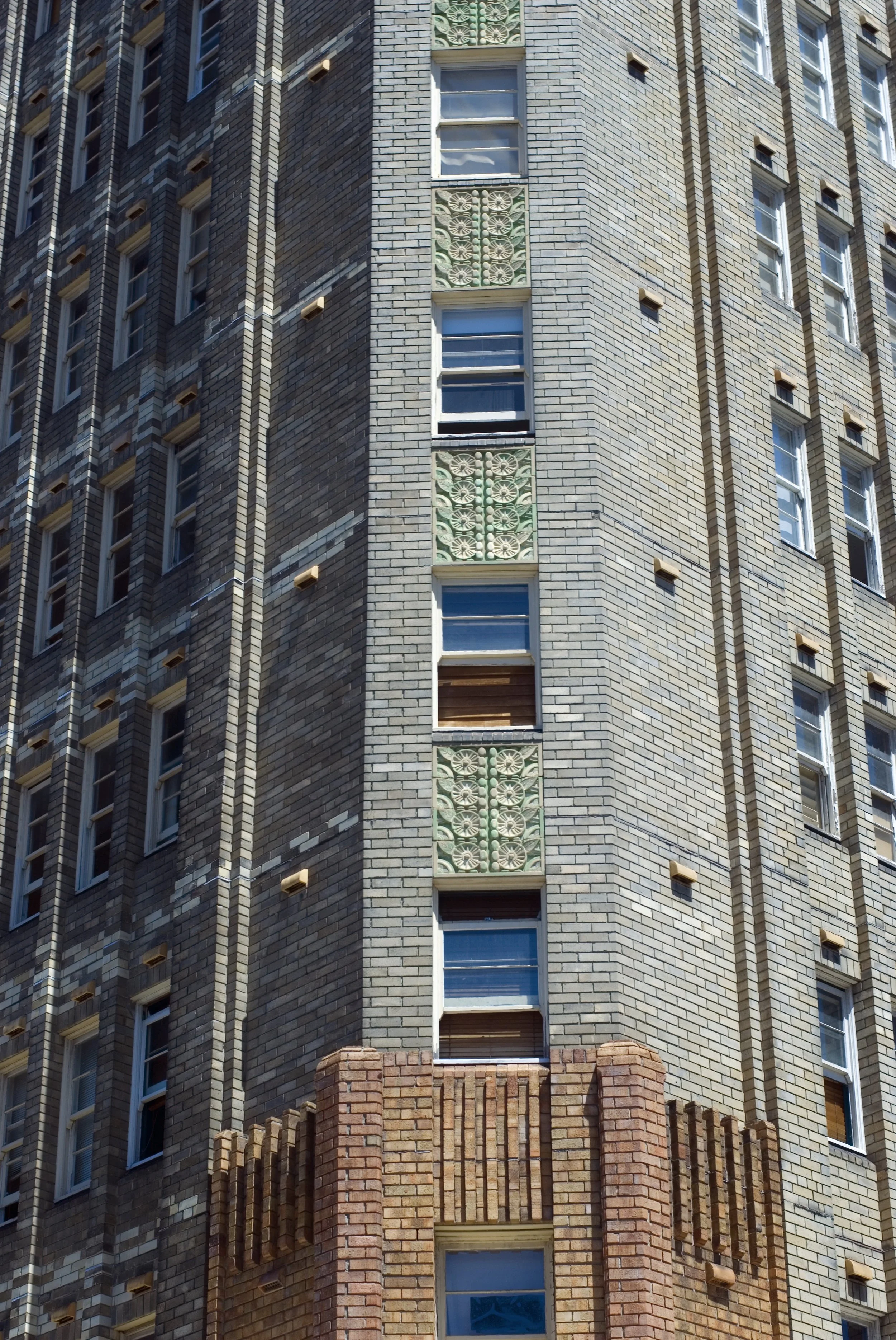
So as explained in earlier correspondence, I was very much inspired by and focused on a design in line with the style and history of the building, which would play on the motifs of a building constructed in 1941 in the Deco style. I looked at the brick work, at your color palette, the terrazzo floors, etc.
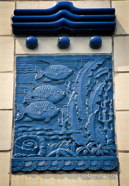
I sent on to an artist a number of Art Deco reliefs for inspiration, which can be seen in the grid below [like all images on this page, you can click on the image for a larger view]:


It took some time, but I received 2 b/w sample images (line drawings) in the style he was proposing:


I asked him to please add color, bearing in mind HIGHLANDS’s color palette, and he sent me this lovely watercolor of the image above and to the right:
After seeing a first mock up proposal, one without backgrounds (just the birds), and one where the bird had a color background, I was sent these 6 samples, based on the color palette. I’m aware there are further colors, but these are samples.


We then mocked up what reliefs might look like on the building and you can see these 2 mock ups below.
[I hope it’s clear that this is one sample bird with a limited color palette. Any real proposal would likely feature many different birds in different poses (10+ I would think) and also likely more colors]


Now, to be very clear, the images and layout above are just a first draft. EG in the earlier phases these 2 images below were created.
The one on the left includes reliefs on the inner alcoves (before we factored in the color palette).
The one on the right played with die-cut bird reliefs and reliefs with color backgrounds (latter of which I strongly preferred)


And of course these layouts are just first proposal.
If you look below on the left, this plays on what we mocked up. Symmetrically placed rectangular reliefs on all the towers plus the north facing side. Below right, you have some random placement on the north side and a matching mural (in same style and color palette) which can go on the garage. This mural can be done regardless of symmetry decisions or rectangular reliefs vs cutouts.


When you think about rectangles vs cutouts, look at the below. The left two images are squared off. One is plaster and one is metal. The 2 on the right are cutout, both appears to be plaster. I think stylistically, regardless of cutout or rectangle the last colored image (from Rockefeller Center), all the way on the right is the one closest to what we are going for, and I think it would be spectacular.


So I’ve shown you a lot and I hope it’s enough for you to get a sense of what we are thinking. I think this could be strong and appropriate if you wanna go for something like this. If yes, we [internally] would need to start having the conversation about materials. Outdoor metal (like dibond) would be the likeliest choice, but we would research plaster possibilities. Most important thing is that this project is installed with safety in mind, and that there will be ZERO doubt that anything would ever present a danger. It would involve some engineering, but that's why we have this budget.
As far as concept goes, do bear in mind that this artistic direction could still thematically accommodate the bird cage concept which we were presented.
Jay, i know you were thinking of something perhaps a bit bolder and flashier, but i think this best matches the aesthetic of both the building and the neighborhood, and I do think that 10-12 color blocks will still be quite striking. I am hoping you like this vision. If not, we’ll work hard to create a different kind of proposal ASAP, since I know we are hoping for a Spring time project.
I look forward to hearing tour thoughts. I think this could be something wonderful.
-Avi